Lucent Technologies
Branding a 100-year-old startup

Our Work
Situation & Opportunity
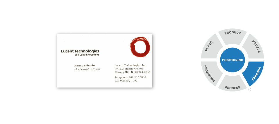
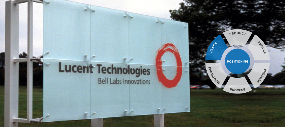
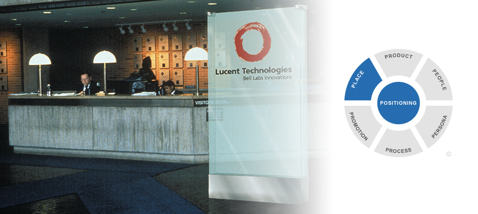
AT&T’s divestiture of AT&T Technologies in the mid-1990s created a new company whose name and identity were prohibited from including “AT&T” or any reference to the regional Bell operating companies. The new spinoff company included the Bell Labs operating unit, which was known for its innovation prowess.
Analysis, Solution & Results
Get the full story behind the work with Lucent Technologies to brand a 100-year-old startup.
Related Work & Stories
See how we refined and re-launched FedEx to become one of the world’s most iconic brands.
See how we elevated and leveraged the DuPont brand, globally.